Birth services logo

222
Creados en 99designs de Vista
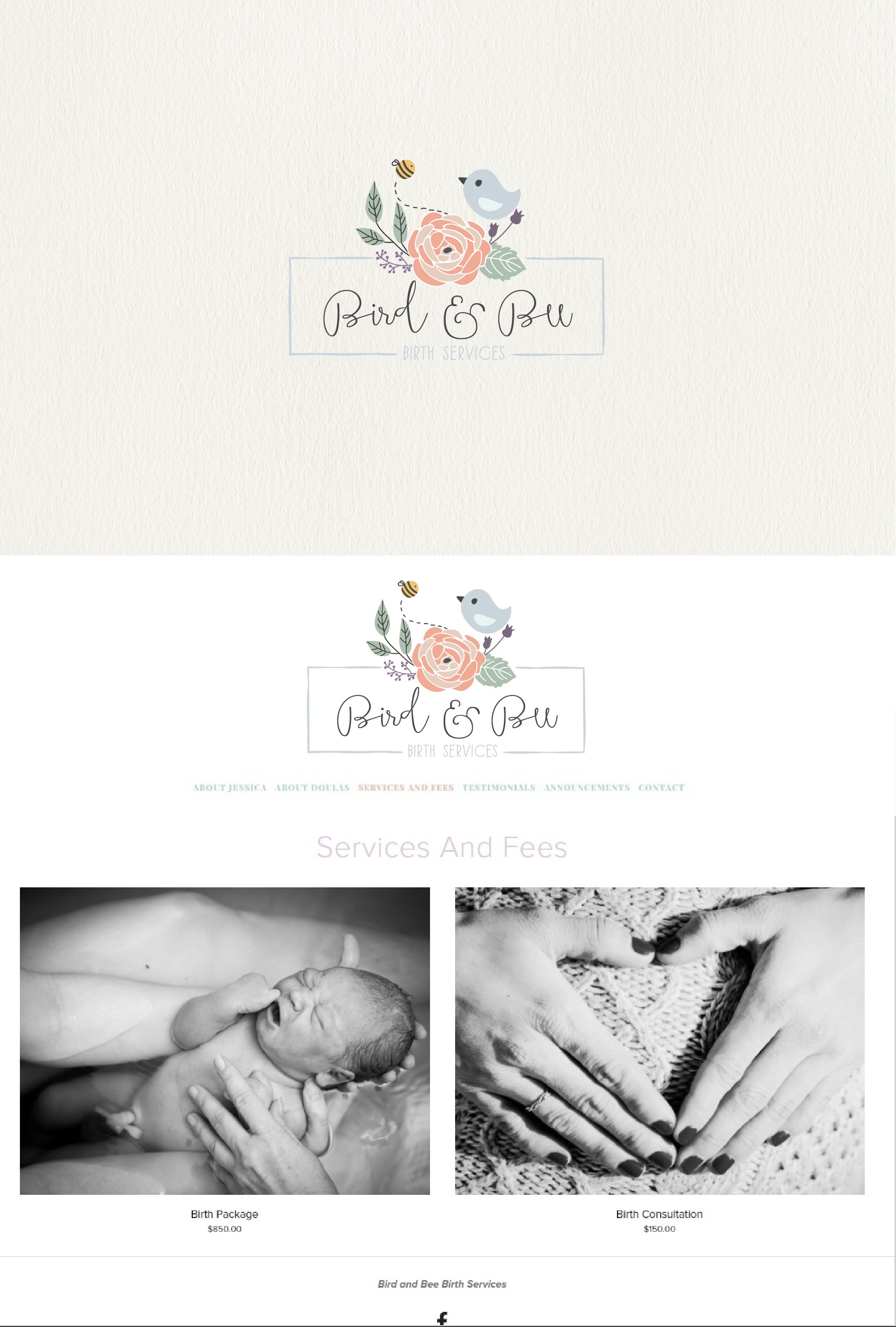
The company's main field, birth services, is very feminine, and as such, it needed to convey a warm, gentle feeling. It was achieved by an airy script font and pastel colors. The characters from the name are also featured in the graphic part to make the company more recognizable.