High quality logo and website design for a brad factory.

128
Creados en 99designs de Vista
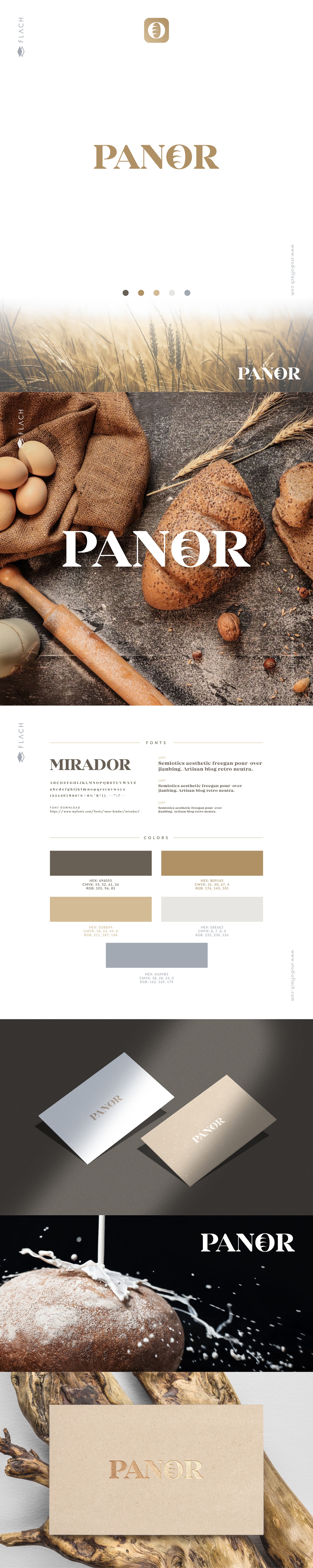
Preparing delicious bread is art. Many can prepare good bread, but few truly master the craft.
It's way more than putting ingredients together. It requires passion, love, and care in every aspect.
What we want your logo to represent are that passion and simple yet surprisingly powerful message.
The Panor name uses serif typography where the letter O is changed into a loaf of bread.
As it's with the Panor name, the logo is strong, simple and easy to use and be remembered by the public.
A brand is way more than just the logo. Here's a compilation, a preview for you to see how the logo works in different places.