
Creados en 99designs de Vista
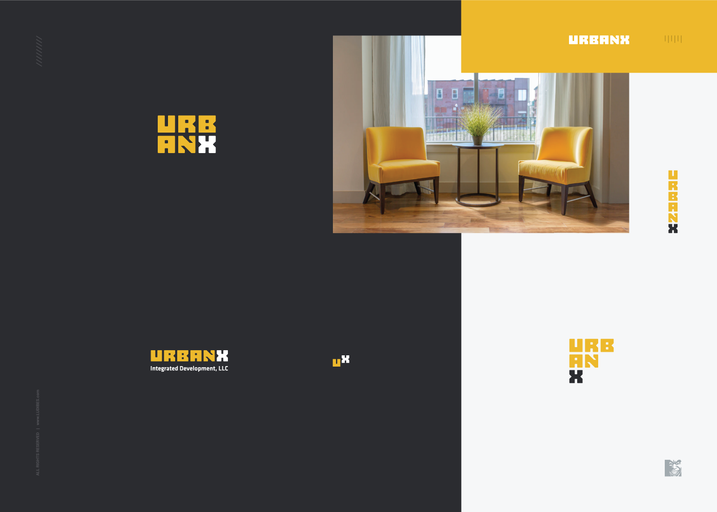
Final and approved logo design for a real estate investment and development company of the new era, focused on multifamily housing for the millennials. Breaking the mold of whats common in real estate world, this custom and unique wordmark is built on simple and blocky letters, which in returns makes this design so modular and responsive. Minimalistic letter form that is still clearly readable is allowing this wordmark to be aranged in a number of layouts, each carrying same unmistakable recognition and unique look.