An elegant logo for a Sustainable Electricity Tariff

53
Creados en 99designs de Vista
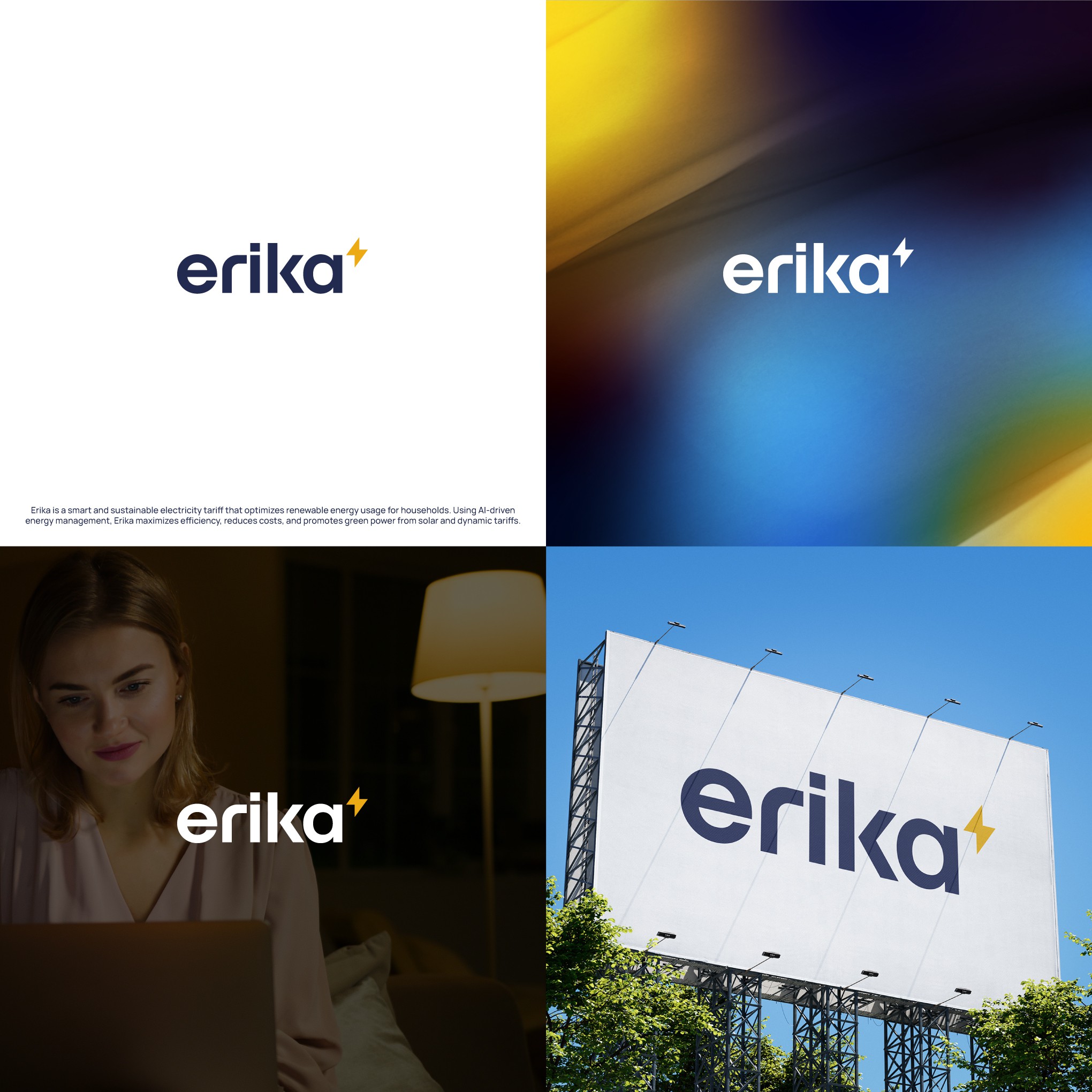
I customized the typography and paired it with a small bolt at the end like it was written in superscript. It is a minimal and bold solution that remains clean and readable even in the smallest of sizes - in a way, the wordmark is 'sustainable'.
The 'e' can be used with the bolt independently as an icon.