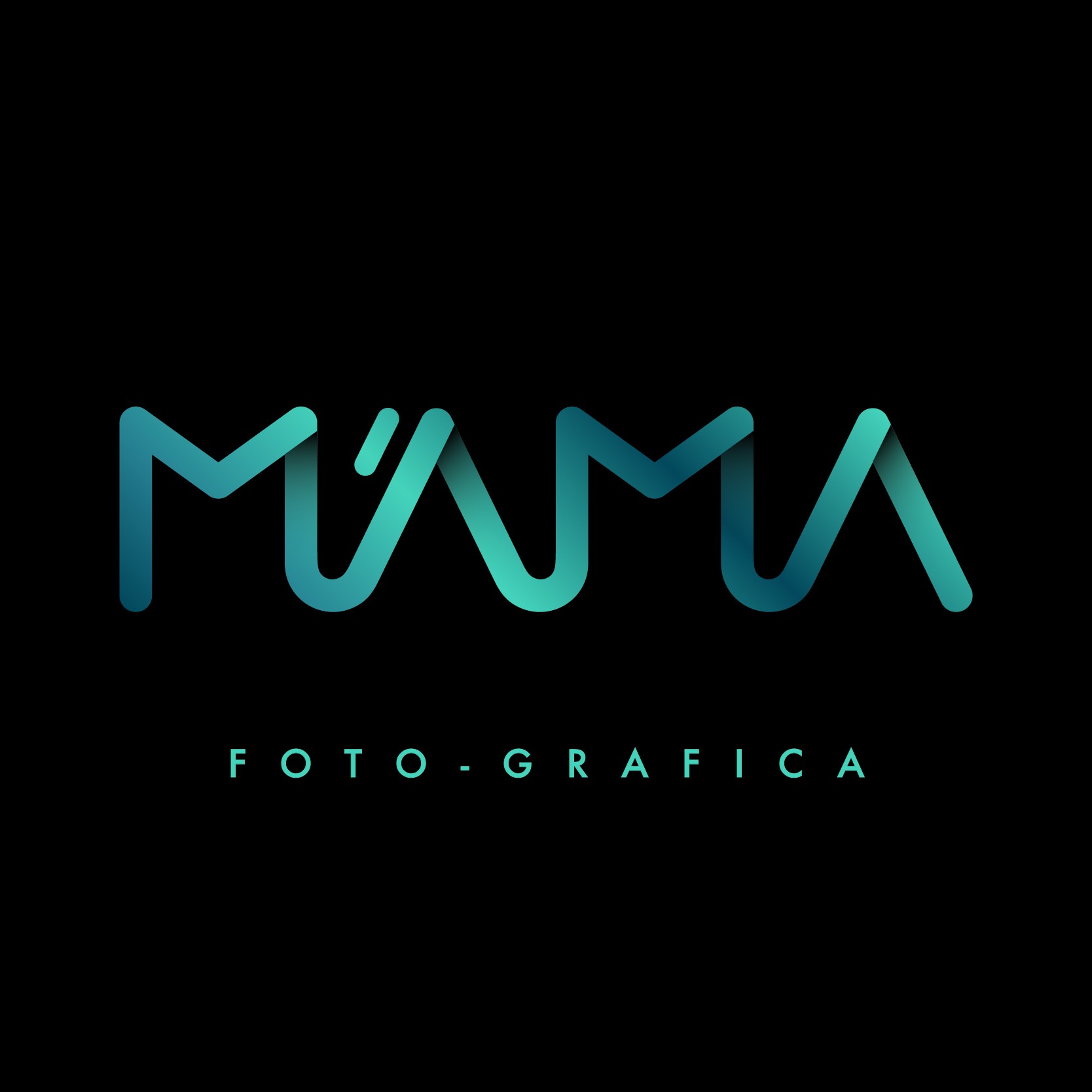
This project involved designing a text-based logo with a clever Italian wordplay, using a monochromatic approach to emphasize simplicity and elegance. The design balances the fluidity of curved shapes with the strength of sharp angles, creating a harmonious contrast between softness and structure. The typography is refined and impactful, ensuring the logo stands out while maintaining a clean, minimalist aesthetic.
The monochrome palette enhances the logo’s clarity and depth, making it both memorable and easily recognizable. Its formal simplicity contributes to its timeless quality, ensuring versatility across various mediums and applications.
What makes this project special is the balance between creativity and clarity. The logo blends playful and professional elements, resonating with its audience while remaining true to its conceptual roots. Its sleek, bold design allows it to adapt seamlessly to different brand contexts.
