
Creados en 99designs de Vista
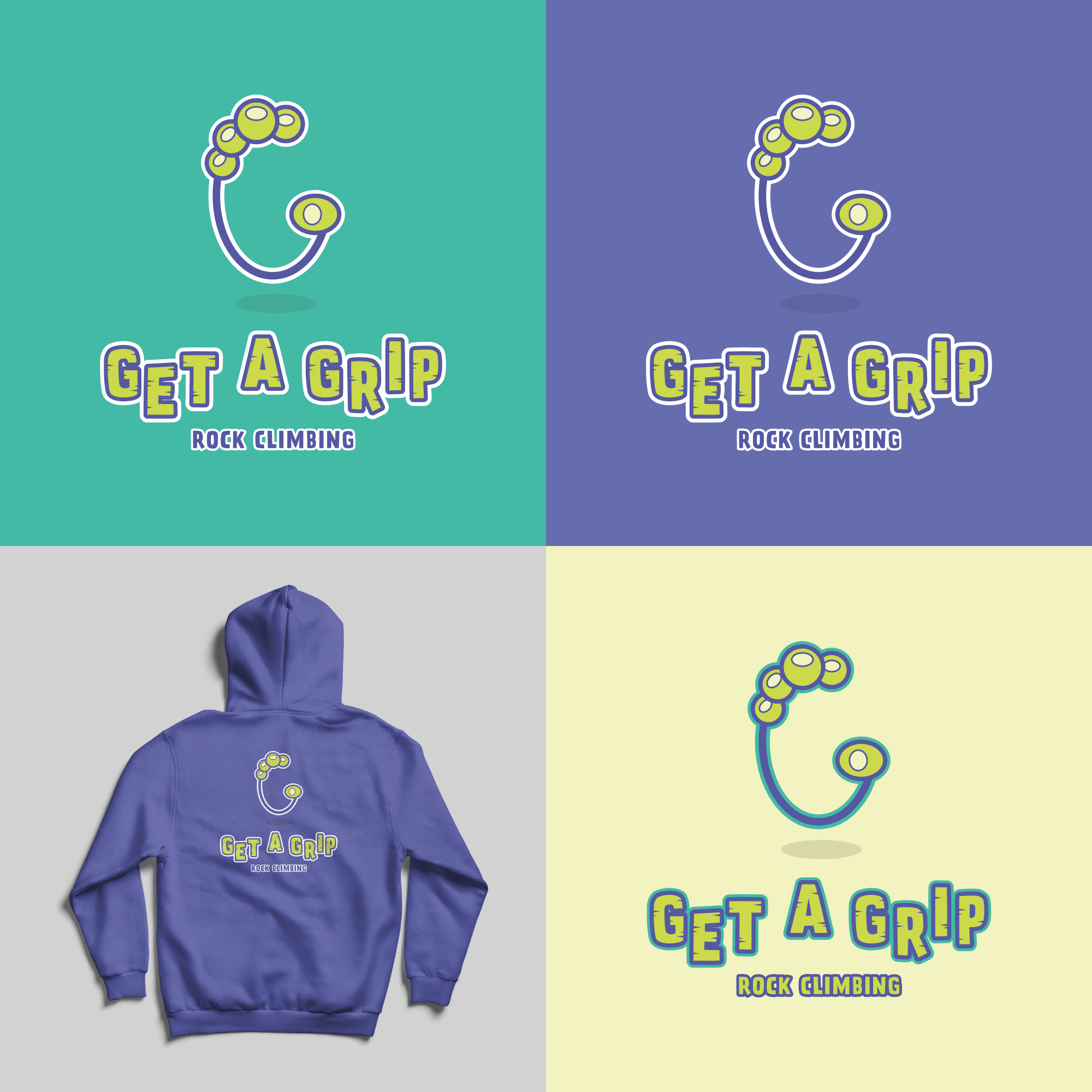
Logo proposal for a family rock-climbing business.
For the "G" symbol, I decided to combine the letter G, of course, with a gripping hand.
For the wordmark, I chose a staggered alignment and a bold sans-serif font; and added some texture to represent rocks/mountains.
I chose bright, contrasting colours (as well as the font style and cartoon illustration style) to make the logo feel fun, dynamic and family-friendly.