
Creados en 99designs de Vista
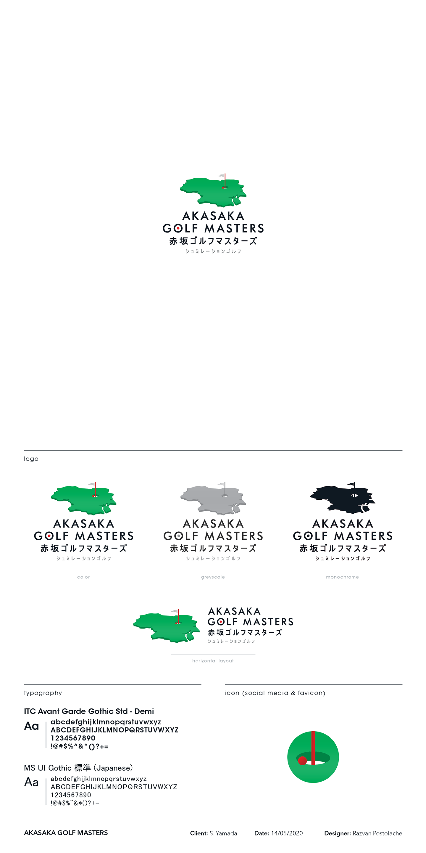
With this proposition, I wanted to create something with an "official" and "modern" feeling to it - which is what I felt would pair really well with the name and the product.
I reproduced and introduced some perspective along with some depth to the golf course map that the client procured - and then introduced a pin flag, a cup, and a red ball in it. I used red to pair with the typography play on the letter "O" (ball in cup from above) and make it reminiscent of the Japanese flag.