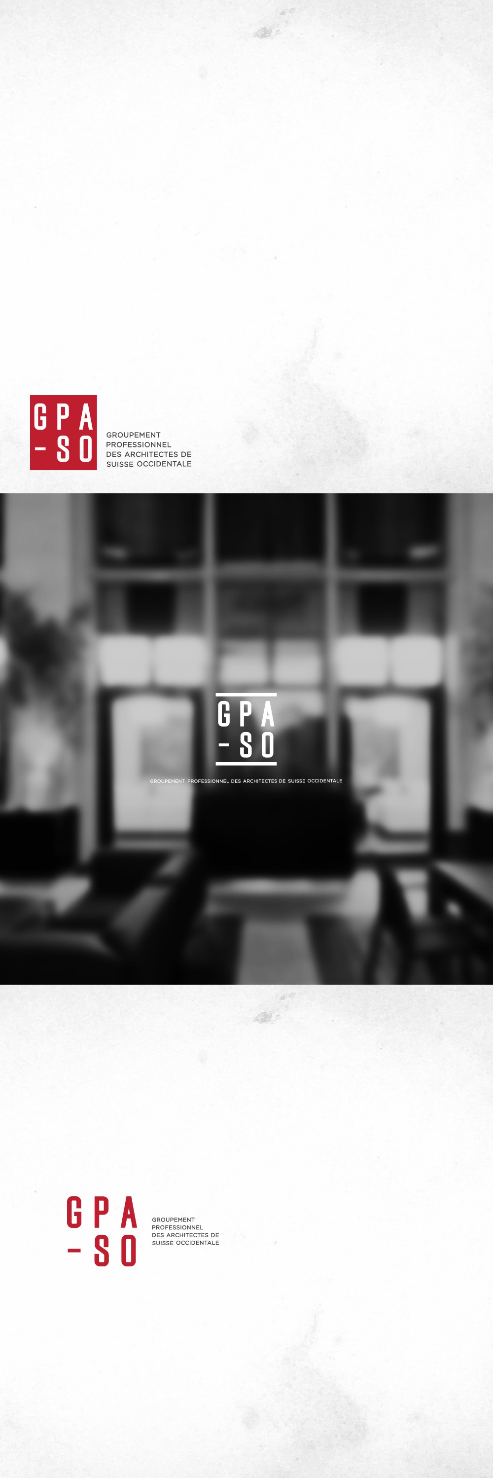
The GPA-SO (Groupement Professionnel des Architectes de Suisse Occidentale) logo was designed with precision and structure in mind, reflecting the core principles of architecture: balance, form, and clarity. The bold, condensed lettering conveys strength and unity, while the clean lines express professionalism and technical expertise.
Red was chosen as the primary color to symbolize strength, energy, and identity within the Swiss context. The vertical alignment and modular grid layout echo architectural blueprints, while the use of negative space ensures a modern, minimalist finish. It’s an identity that speaks with both authority and design sensibility.
The logo is crafted for flexible application across both print and digital environments—from official letterheads and architectural plans to web platforms and conference signage. Its simple yet impactful composition ensures visibility and brand recognition in all sizes and settings.
