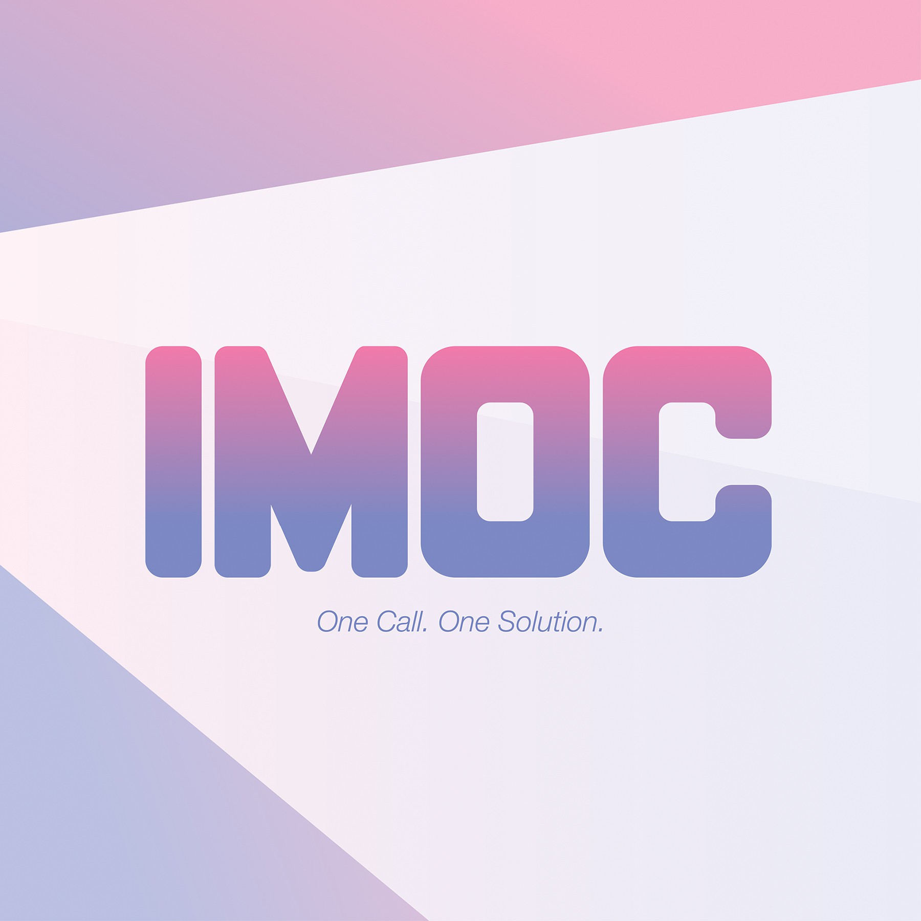
Custom logotype using the 'I' character as a base to create the other letters M,O, and C for the company name. It can be used as a mark on its own using one color OR with gradient tones. I went with the gradient pink and purple to convey "futuristic" and "tech" without it being too playful. I decided not to add any other shape or logo to the IMOC logotype to make sure the name stands out on its own. Having it drawn as customized typography should be enough to make it a memorable mark to the end-user. I also left out the word "solutions" on purpose because I felt that it diluted the brand name and it is not required to have it on the trademark. If i am wrong on that last part, it can be easily added-on using a common sans-serif typeface such as Museo or Helvetica.
(This design was declined by client)
