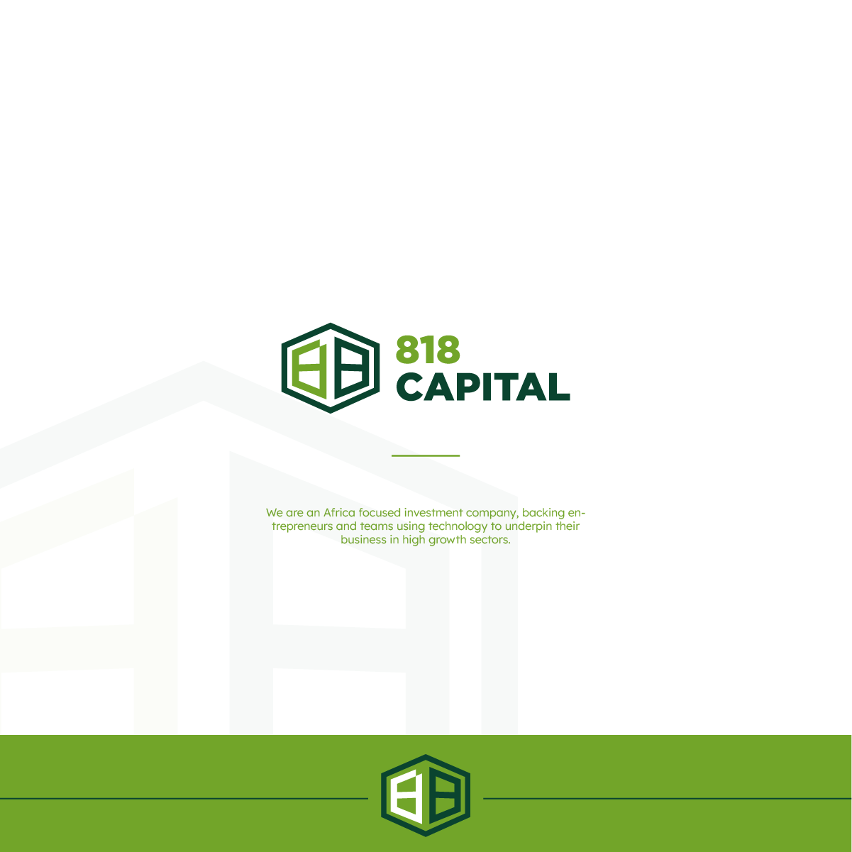
Logo Design for 818 Capital
1
Creados en 99designs de Vista
Logo proposal for an investment company called 818 Capital. I like the simplicity of the symbol and the idea of having the 1 formed out of negative space between both eights.
Feel free to get in touch so we can discuss what's best for your business and create a visual that will communicate your brand most efficiently:
https://99designs.com/profiles/visualxriss
