- Inicio
- Logotipos
- Concursos Logotipos
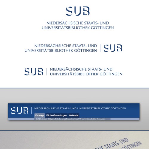
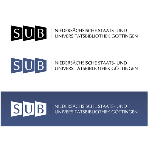
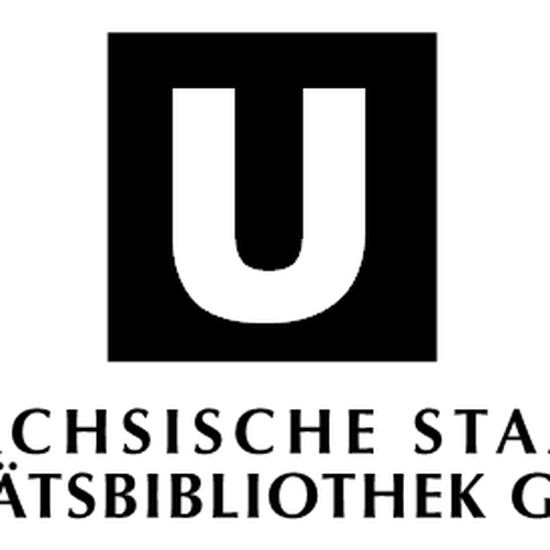
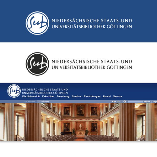
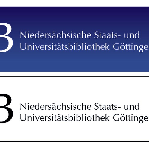
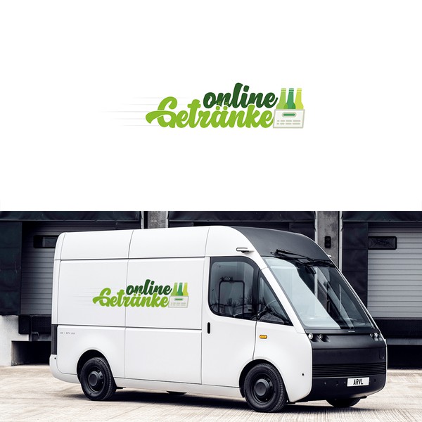
- Logo for Göttingen State and University Library
Ralf Stockmann tuvo su nuevo logotipos a través de un concurso de diseño:

Ver el concurso de Logotipos de Ralf Stockmann...
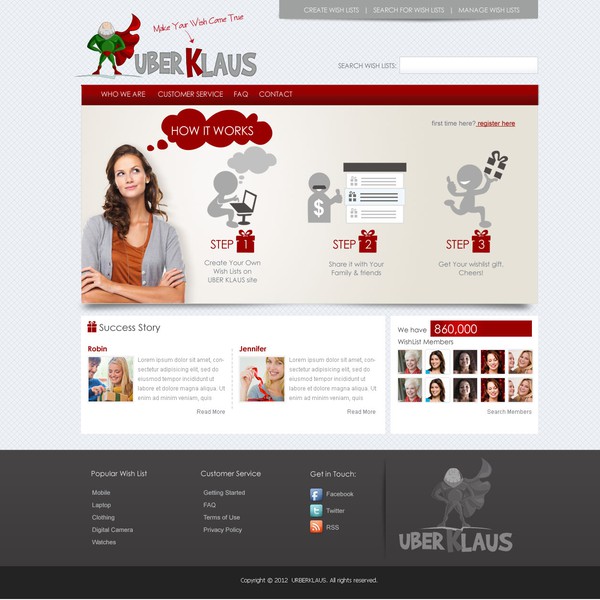
Todo comenzó con un brief de diseño.
Una guía rápida e interactiva le ayudó a comprender su estilo de diseño y capturó exactamente lo que necesitaba en su logotipos.
Diseñadores de todo el mundo presentaron su magia del diseño.


propuestas de diseño
Obtendrá muchos conceptos de diseñadores experimentados de todo el mundo.
diseñadores
Trabaje con diseñadores talentosos y profesionales en Logotipos para convertir sus ideas en realidad.
ganador
Seleccionar su Logotipos personalizado favorito (¡o dos! ¡O tres!). Y el diseño es todo suyo.
Ralf Stockmann colaboró con diseñadores para refinar sus ideas
Califica los diseños
Cuando comienzan a llegar las propuestas de diseño, puede calificarlas para que los diseñadores sepan lo que está buscando en el diseño de su logotipo.
Dar feedback
99designs tiene excelentes herramientas de colaboración para que pueda identificar y capturar sus ideas
Y luego ... ¡seleccionaron un ganador!

Reseña de clientes
Perfekt, sehr zu empfehlen, kompetent und freundlich.
AnónimoEn el camino, se encontraron con muchos diseñadores talentosos ...


Creemos que los concursos son una forma súper divertida de obtener diseños.
Concursos terminados recientemente:
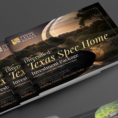
Luxury Real Estate Investment Brochure for Sterling Creek Homes’ Diversified Texas Spec Home Package
High-net-worth investors, private equity partners, and strategic capital groups interested in luxury residential real es
entries
designers
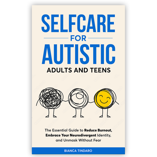
Selfcare for Autistic Adults and Teens
Autistic teens and adults (primarily 16–45), as well as parents, educators, and therapists who support neurodivergent pe
entries
designers
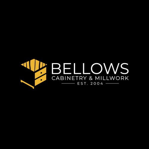
Cabinet Company needs new identity!
Custom Cabinetry, Millwork, residential and commercial
entries
designers
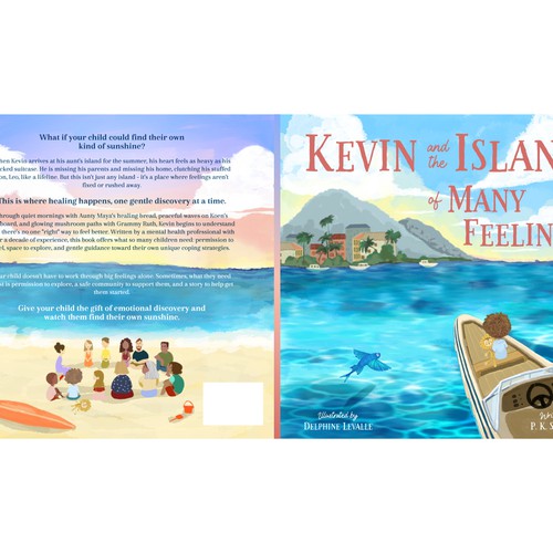
Book Cover design for a Calming, Heartfelt Children’s Story.
Parents and early readers ages 5-9 years old
entries
designers
Poetic & Minimal Book Cover about Trust, Stillness, and Inner Wonder — for mindful young readers.
This book is for those who seek inner peace, meaning, and trust in a noisy world – for young adults (16+) and all who un
entries
designers
Attention Grabbing Excavation clothing design for growing business
hoodies and T-shirts I can sell to customers to help advertise my business. Needs to be something people want to buy and
entries
designers
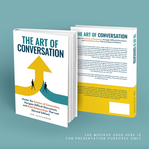
Modern, sophisticated cover for 'The Art of Conversation' - personal development for genuine connect
Men ages 18-35 struggling with social anxiety, shyness, or feeling socially "stuck"; Anyone regardless of gender who wan
entries
designers
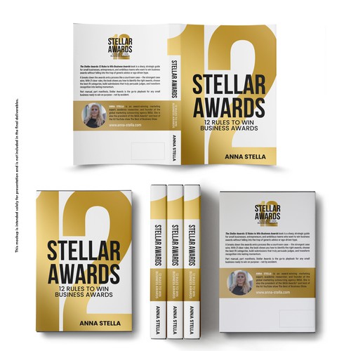
Stellar Awards: 12 Rules to Win Business Awards
Entrepreneurs. Mainly small business owners. 60% male, 40% women. Audience: English-speaking countries. They usually hol
entries
designers
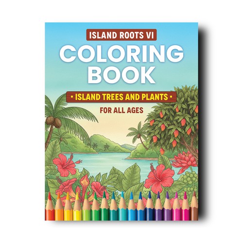
Caribbean Coloring Book Cover design to appeal to all ages
The target audience is for all ages and gender.
entries
designers
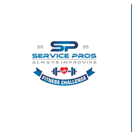
Company Logo - Fall Fitness Challenge
We install flooring (carpet, laminate, tile, hardwood) in residential homes in the United States
entries
designers

Make waves with my sophisticated "G"
General dermatology, surgery and aesthetic care targeting all ages and genders.
entries
designers
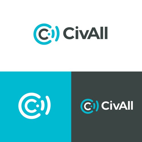
CivAll, SaaS Civic Engagement Logo Design
SaaS Civic Engagement Platform, CMS, social media management and communications tools for local governments.
entries
designers
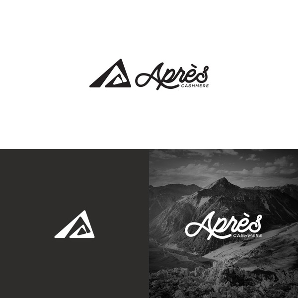
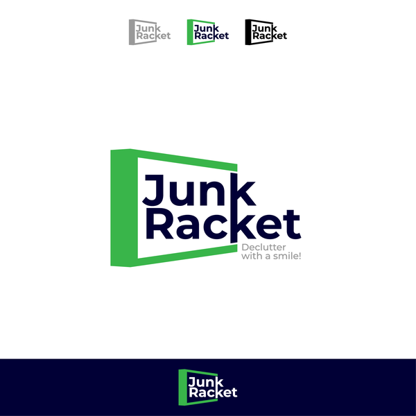
Ver otra inspiración de logotipos
 de bo_rad
 de pecas™ Carola Beker
 de Asaad™
 de 3AM3I
 de -Alya-
 de artsigma
 de Bion
 de artsigma
 de Hugo Maja
 de spARTan