Información necesaria
Nombre a incorporar en el logotipo
grokkist
Eslogan a incorporar en el logotipo
learn without feeling lost
Descripción de la organización y el público al que apunta
We are an online platform that offers personalised learning experiences designed to excite lifelong learners, adapted to your individual learning preferences.
Industria
Educación


Referencias
Otras notas
I want to visually communicate 'navigation' and 'excitement'. Learning something new often feels like being lost in an unfamiliar city - what you really want is a map, a guide and a personalised itinerary prepared by someone you trust. Grokkist helps you learn without feeling lost.
Grokkist is designed to help answer the kinds of questions you wish you could ask Google but to which Google doesn't have the answer:
Eg ‘How do I?’
• Build an audience
• Become a leader
• Talk to prospective clients
• Lead my organisation through change
• Keep my team on track to complete a project
As a learner, you pick a practice, then create a personalised itinerary (a learning project). You have a guide available to the extent that you want, and the content delivery adapts to your learning preferences.
I host a podcast called Still Curious which explores these themes. A good example is this episode (https://www.stillcuriouspodcast.com…onal-s1e2/) - Listen from 44:45 - 46:40 - I'd like the logo to convey the 'brain explosion' feeling.
The idea of 'rediscovery' (also a navigation metaphor) is important, because instinctively we all know what exciting learning looks like but we may not have experienced it for a long time. It's like the scene in Ratatouille where Anton Ego eats the ratatouille and is transported back to childhood - BAM! This logo should aspire to that.
I spent a little while playing around on TailorBrands to make some comps. The best one is attached below. Feel free to develop it further, or scrap it altogether and go in a different direction. I offer it just as a reference.
Finally, below is some draft marketing copy that explains the problem Grokkist solves in more detail:
--
How many times have you needed to start learning something new entirely from scratch and wondered where to start or even what to search for?
And how many times did you find someone to give you a welcome orientation, a sense of direction or a map?
In a world where we’re all supposed to be lifelong learners with the world’s information at our fingertips and algorithms to personalise our every interaction, why does trying to actually get a grasp on something new often feel so difficult and overwhelming?
The good news is, it’s not you.
The truth is, most educational offerings simply aren’t designed with the learner in mind. Especially not for people who already lead full and accomplished lives and who have courage to decide to make space to suck at something new.
Sure, you can do a university course to learn the theory if you don’t mind taking years and sitting with kids just out of school or mid-career professionals who are building on foundations you don’t have.
Or you can pick through hundreds of how-to video tutorials, books and online forums if you don’t mind spending an eternity just to painstakingly figure out exactly what to ask and then still feeling like giving up when you try to put it into practice yourself.
Maybe you can get help from a professional coach if you don’t mind spending lots of money and making a big upfront psychological commitment to mastering something when you’re not even sure what you want yet.
Does any of this resonate with you?
At Grokkist, we have fallen in love with the problem of how to take care of lifelong learners who have the courage to suck at something new and are ready to learn, but who are still looking for a personalised learning experience that is ready for them.
We love that there is more educational content available than ever before and more advanced technology than you can imagine to help find and organise it, but we also know that nothing beats having a great teacher who is as excited about your learning as you are and who will help you grow in ways you never knew were possible.
And we understand from experience that sometimes all it takes to have a truly life-changing learning experience is a 15-minute conversation with the right person at the right time.
At Grokkist, we are on a mission to design life-changing experiences for lifelong learners. Because technology can help, but only a person can care.
--
UPDATE 11/11
Hi everyone, thanks so much for your submissions so far! I have some general thoughts:
1 - It's important to include the tagline. This company is trying to create a new product category in education, so the logo-mark itself will not be able to communicate this alone. What we want is to visually convey an idea of what the company will do (navigation + excitement) and then contextualise that with the tagline which tells us it's about learning. Otherwise we may be mistaken for a travel company!
2 - I would like the logo device to talk to the logo text in some way. Submission #12 is an example of what I mean. Some of the other submissions have ideas that could be developed further by talking to the logo text.
3 - Some of the submissions use devices like a compass or a mortarboard. While these are connected with navigation and education, they are not symbols that personify the brand identity. We are aiming for modern (ie online learning platform) and playful - child-like but not childish, and without the formality or conservatism of academic symbols like the mortarboard hat. (This is something I realise I didn't explain in the original brief, but reviewing the submissions made me realise!)
4 - Colours. I'm not especially attached to the green/orange colours from the reference image. The multicolour approach in submission #24 is appealing and reflects a dynamic sense of variety. I don't have fixed views on the colours but I'd suggest multi-colours will work better.
5 - We are aiming for *personalised* learning, so individualism is important to convey. #24 does this well with the variety of colours and shapes. The logo device in #27 also conveys individuality with the variety of shapes. One of the things I liked about the original reference image I supplied is that the journey in the navigation isn't a straight line, which reflects the way people learn. #14 suggests an individual journey via the dotted line, this could be developed with more personality if it didn't follow such an obvious path.
Hope this helps - I will respond individually.
Keep 'em coming!
Best,
Danu
--
UPDATE 12/11
Hi everyone, thanks so much for your many submissions. I appreciate the effort and creativity you've put in and the entries are making me think hard about the most important things I want to communicate with this design. Thanks also for your patience as I refine the brief in response to your work.
The current range of designs tend to emphasise navigation in terms of precision, with heavy use of the navigation pin as the main device. On reflection, I think what may be needed is a more subtle interplay of elements that together convey navigation, exploration and an individual, personalised journey.
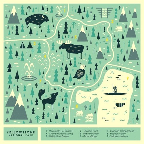
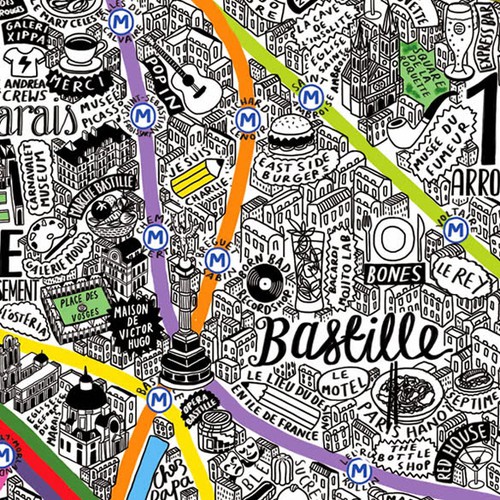
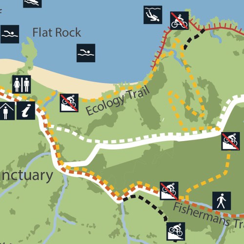
I have uploaded some examples of illustrated maps that might be useful inspiration. I like them because they are a stylised and playful representation of navigation and exploration, where someone has done the hard work of pointing out places to visit, paths to take and, in the case of the national park map, how difficult it is and how long you can expect it to take.
The learner (ie the customer) is an explorer. They have decided to have a moment of courage to get out and try something new - an exciting learning adventure in unfamiliar territory. Grokkist recognises and and respects that spirit of exploration and curiosity and facilitates it by marking the way, pointing out the different paths to learning and guiding the learner to things we know they will find interesting along the way. The learner is in control and will choose their own path for their situation, but Grokkist is there to signpost the way and be a helpful guide to make sure they have the exciting adventure they came for.
Therefore, the logo needs to sit at the intersection of the customer need and what the service provides and visually communicate both aspects at once.
I realise this is a lot of new information - it is only through looking at your designs that I have been able to come to this level of clarity about what I want from the design. Look forward to seeing what you do with this - send me a message if you want to discuss further.
Best,
Danu
Archivos finales del concurso
1 x Logotipo
Ganador del concurso
1 x Guía de la marca
Archivos finales
Si usa tipos de letra que requieren licencia, confirme que el cliente esté de acuerdo con su uso. Por motivos de licencias, es mejor proporcionarle a su cliente información sobre cómo adquirir el tipo de letra en lugar de proporcionarle los propios archivos.
El texto en logotipos debe convertirse a letras sin relleno.