Información necesaria
Nombre a incorporar en el logotipo
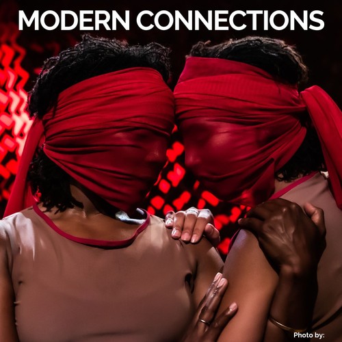
Modern Connections
Eslogan a incorporar en el logotipo
Descripción de la organización y el público al que apunta
● WHO WE ARE & WHAT WE DO
➤ Our vision: Movement is one of the first forms of communication that we experience. In the womb we are moving and then somewhere along the way to adulthood we lose our intentional relationship to it. As a lifelong embodied practitioner, I understand the importance of being connected to the body as a technology for expression, processing information, spiritual alignment, scholarship and archival methods, as well as a pathway to empathize and feel compassion for others. Movement and Dance is all encompassing and as an artist, I think of my work functioning as a trojan horse for liberation with the goal of everyone getting free.
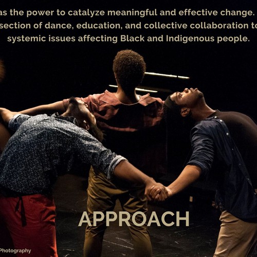
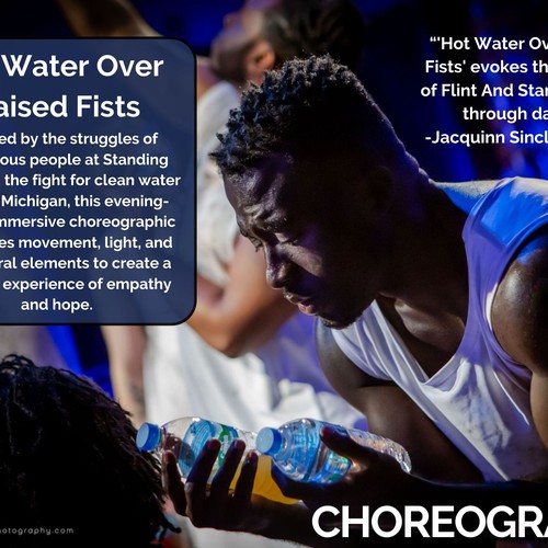
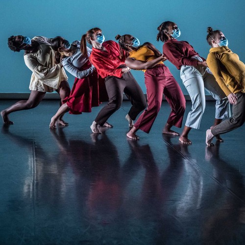
➤ Our mission: Modern Connections' mission is to push the edges of visceral movement - provoking personal reflection, conversation, and community transformation. We strive to create the causes and conditions for liberation, pause, and healing; to elevate systemic issues affecting Black and indigenous people; and to shift dance from the margins of society into a prominent visible position for the public. Our tagline is “Where Movement Meets Meaning”
➤ Our values: Belonging, accessibility, liberation, connection, transformation, healing, community, creative expression, innovation, collaboration, culturally responsive, reflection, education, intentionality. These are some of the core tenants of Jenny’s pedagogy that are frequent phrases in the classroom:
- 50% correct is better than 100% wrong
- Consistency builds strength
- Opposition creates balance
- Do what’s best for your body
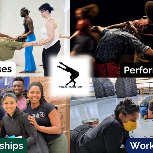
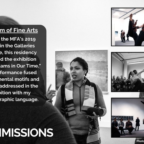
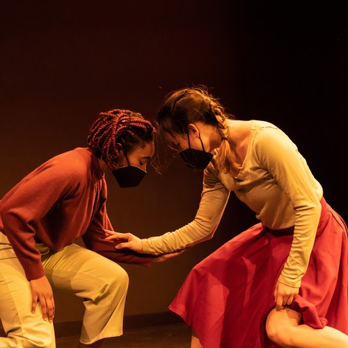
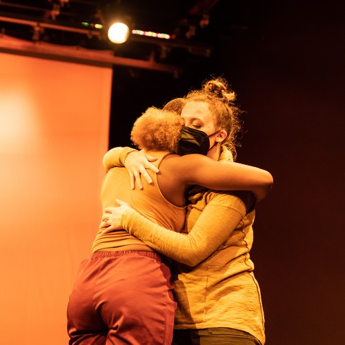
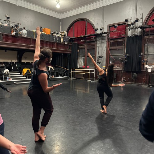
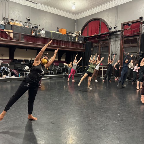
➤ What we do: We encourage you to watch the 5-minute Modern Connections Mini Documentary (https://www.youtube.com/watch?v=rY3…DZ5U&t=12s) to gain a deeper understanding of the multiple facets of our work; learn more about our history, mission, and values; and take in visuals from our classes, performances, workshops, and partnerships. Our Instagram (@modern_connections) also offers visual inspiration and context for our work.
➤ Our personality: Intuitive, understanding, artistic, welcoming, community-centered, dedicated, adaptable, equity-minded, attentive, reflective, engaging, dynamic, passionate
➤ Brands we are inspired by:
We draw inspiration from both the work and the representation of the work of the following artists. A document with the links to these is included below in the Design Inspiration section:
1. Koresh Dance: https://issuu.com/koreshdance/docs/kdc_booklet
2. Limón Dance Company: https://www.limon.nyc/_files/ugd/0f…0656a7.pdf
3. A.I.M by Kyle Abraham: https://lotusartsmgmt.com/wp-conten…262020.pdf
4. The Feath3r Theory: https://indd.adobe.com/view/8cfb1df…5446ef63db
5. Duniya Dance & Drum: https://www.duniyadance.com/press-kit
6. Camille A. Brown: http://pmgartsmgt.com/wp-content/up….23.17.pdf
7. FIst and Heel Performance Group: https://static1.squarespace.com/sta…ssKit_.pdf
8. Amanda Selwyn: https://amandaselwyndance.org/pdf/A…essKit.pdf
9. Scorpius Dance: https://www.scorpiusdance.com/wp-co…_KIT_2.pdf
10. Movement Migration: https://static1.squarespace.com/sta…24821/2019
11. Jennifer Archibald: https://archcore40.wpcomstaging.com/whats-next/
● OUR TARGET GROUP
➤ Folks interested in dance, movement, art, and liberation. Those interested in Modern and contemporary dance styles and those who engage in liberation movements may be particularly interested in our work.
➤ Dancers of all levels: From movement enthusiasts and recreational dancers, to professional dancers of various styles/genres.
➤ Folks who hold a variety of identities attend our offerings. Perhaps one of the most consistent markers for our classes is age. We tend to attract customers in their mid 20's to mid 40's. However, we do have a growing cohort ages 50+ to 70+. On the outer edges of our range, we have had high school-age customers/younger college students and folks in their 90's.
➤People who engage with our content in-person are typically located in and within a 60-mile radius of Boston, Massachusetts.
________________________________________________________
➤ How do we want our audience to describe our brand?
We hope that the testimonials below will illustrate how people feel about their Modern Connections experience:
“I am grateful deeply for the sacred and safe space that is Modern Connections, a healing space of mind, body and soul.” - Class Participant
“I thought the workshop was extremely meaningful and motivating, and I would love to participate in similar or more expanded programming going forward. Everything about it made me feel connected to the other participants and to myself” - Workshop Participant
“Thank YOU for a fabulous weekend and for bringing mindfulness to movement for our museum guests! People absolutely loved you all.” - Performance Presenting Organization
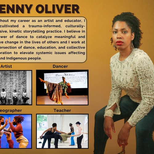
“For years I had the pleasure of collaborating with Jenny Oliver. I witnessed her challenge the perceived bounds of movement while bringing newcomers and experienced participants presently along. Seeing her work diligently evolve through her creative spirit and willingness to wade into the unknown is inspiring. Jenny Oliver is an incredibly thoughtful collaborator who brings years of experience to the creative work she embarks on. No challenge is too small and Jenny has shown time and time again that she is up for any challenge. Her ability to connect and ground participants– tend to their creative selves and bring their light into the fold of the work is truly a wonderful skill she exudes throughout her practice.” - Government Agency Partner
Some of the expressions of gratitude from folks who participate in classes, workshops, and performance from our last fundraising campaign:
“Modern Connections has been a well of community and movement inspiration. I am constantly grateful for the nourishment Jenny, Amy, and the other dancers in class have given me since moving to Somerville.”
“Thank you for creating such a beautiful, welcoming and reflective space for so many people to connect through movement!!!!”
“Thank you for creating space for dance in our community, it has impacted my life more than I can express.”
“Thank you for crafting a place for self-discovery, therapy, and rejuvenation!”
“Thank you for creating this incredible space to both be in our bodies and in community! Your class is my happy place, and I am so grateful to be part of this beautiful community. 💜”
“Thank you for fostering this beautiful and important community! Looking forward to 2024 <3”
“This community is so important, thank you for all you do to bring us together!!”
“Thank you Modern Connections for the most fun dance classes and community!”
● OUR CORE VALUES
➤ Connection
➤ Liberation
➤ Belonging
_________________________________________________
- Industry: Dance/Public Art/Performing Arts
Industria
Entretenimiento y bellas artes
Estilo visual
Colores a explorar

Otros requisitos relativos al color
Some of the colors that we gravitate to are blue, yellow, green, purple, black, and white. We’re open to seeing what you recommend. You don’t have to use these colors, but these are some options that we have been playing around with on our website/press kit/fundraising advertising assets:
Here are the main colors we used for our fundraising assets:
Black: #000000
White: #ffffff
Green: #054b36
Blue: #0d245d
The template theme for our website is called “Natural.” These are the elements of our current palette, but we can customize them:
Primary: #141B4F
Secondary: #FFB236
Accent: #FFFFFF
These are some of the colors that are in photos selected for our press kit:
Blues: #13189c, #2374bc, #357493, #4a8fd1, #1f3058, #407f9c, #17164e
Yellows: #f2b42e, #ce9434
Oranges: #ca692b, #a33117
Beiges/Browns: #bbae89,#733636, #723f26, #c97736, #774936, #733e1b, #ad856b
Purples: #4c67e2, #590b3c, #411b65, #25035c, #400999, #692081, #5d76ee
Greens: #3d4123, #626e2e, 334c30, #8daf76, #afb961
Reds: #bf352a, #a72122, #54120c, #a15247, #be2b21
Greys: #4c4c4c, #7d7d7d, #a4a4a4, #686868
Atributos de estilo

Referencias

Otras notas
● STYLE & IDEAS
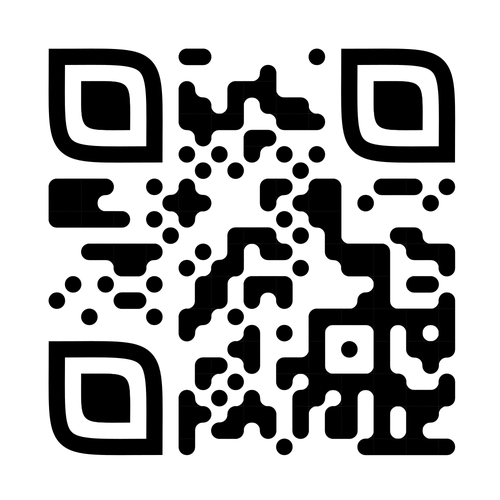
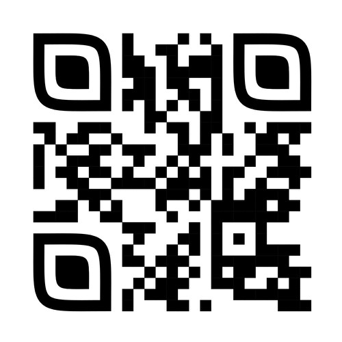
➤ One stylistic element that we’re interested in exploring is integrating a QR code into our logo (check out two possibilities in the attachments of the References section). We would like folks to be able to scan the logo and be directed to our website or Instagram.
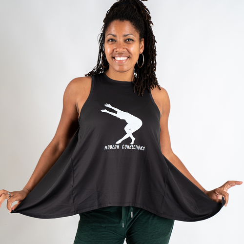
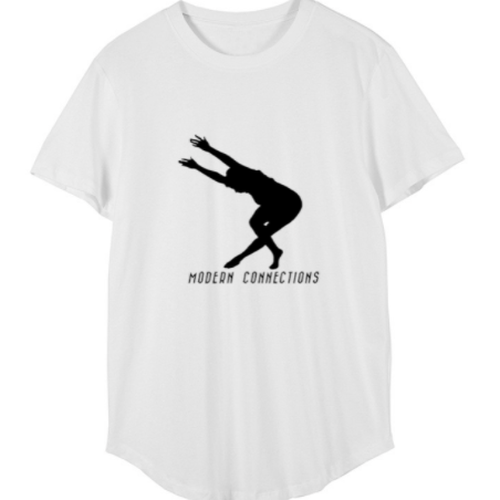
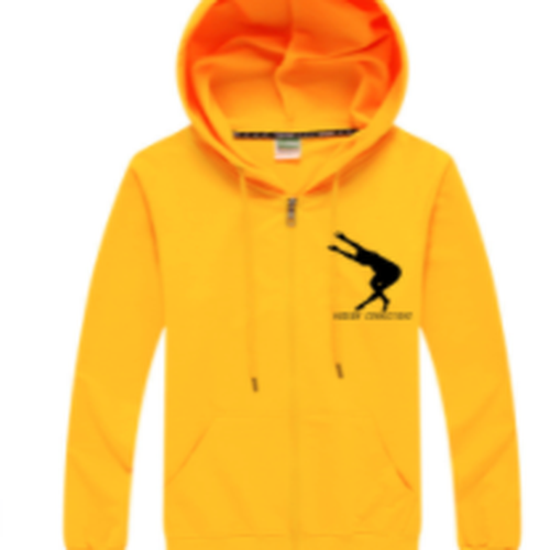
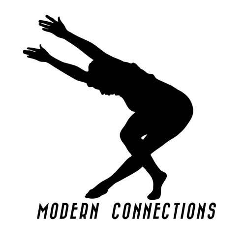
➤ Our current logo is the outline of a photo of founder Jenny Oliver assuming a classic Horton Modern position.
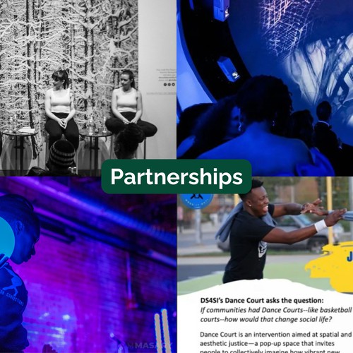
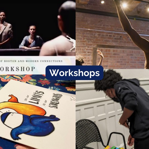
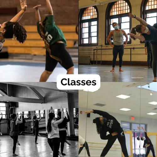
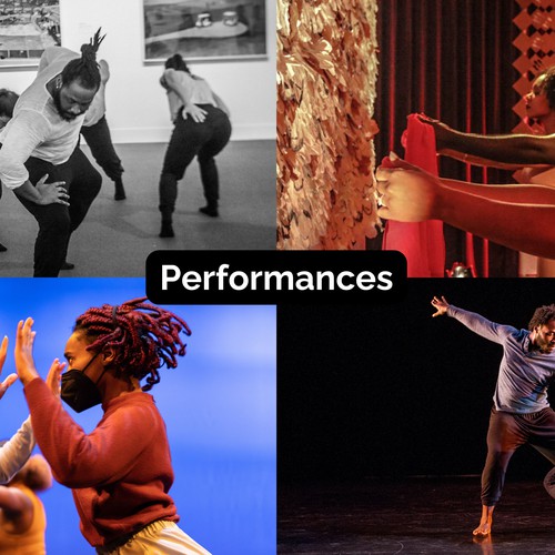
➤ We’re interested in something that can be incorporated / complementary to our current logo - perhaps something that goes around or behind it that demonstrates the four prongs of our organization: Classes, Performances, Workshops, and Partnerships
➤ As a movement-based organization, we’re curious if the logo can be designed in such a way that it looks like it moves, or some parts fade in and out, or has an optical illusion quality where it looks differently depending on the angle that you are viewing it from.
_______________________________________________________________________________
● LOOK & FEEL
➤ Again, not necessary to include, but we do have some fonts that we’ve used in a couple of assets: Raleway ( https://fonts.google.com/specimen/Raleway) is the font in the current draft of our press kit and Brandon Grotesque ( https://fonts.adobe.com/fonts/brandon-grotesque) was used in our mini documentary.
➤One of the main goals that we have with the brand colors that will emerge from this contest, is to incorporate them into our press kit. You can check out some of the colors, images, and fonts that we’ve explored in our exploratory draft of the press kit (https://www.canva.com/design/DAFtHz…dcCQ/watch). The urls in the “Brands we are inspired by” subsection of the "Describe what your organization or product does and its target audience" prompt can provide additional visual inspiration.
● WHAT TO AVOID
➤ Because this logo will often appear next to dynamic images of dancing, being too busy may be distracting.
➤ Whatever is created will need to have at least one version that can be produced in black and another in white so that we can overlay the logo on a variety of colors. If the logo is dependent on its other colors, then that may not work for our various uses.
_________________________________________________________
Archivos finales del concurso
1 x Logotipo
Ganador del concurso
1 x Guía de la marca
Archivos finales
Si usa tipos de letra que requieren licencia, confirme que el cliente esté de acuerdo con su uso. Por motivos de licencias, es mejor proporcionarle a su cliente información sobre cómo adquirir el tipo de letra en lugar de proporcionarle los propios archivos.
El texto en logotipos debe convertirse a letras sin relleno.
We are open to variety of ways that our logo could be reimagined or enhanced. Many of the selections that we made are similar to our current logo in the sense that they involve the organization name and/or a relatively simple graphic.