Información necesaria
Nombre a incorporar en el logotipo
Part C
Eslogan a incorporar en el logotipo
Descripción de la organización y el público al que apunta
We are a national Medicare brokerage firm (insurance). Medicare is TYPICALLY for 65 year olds and up.
Industria
Medicina y farmacia


Referencias
Adjuntos
Otras notas
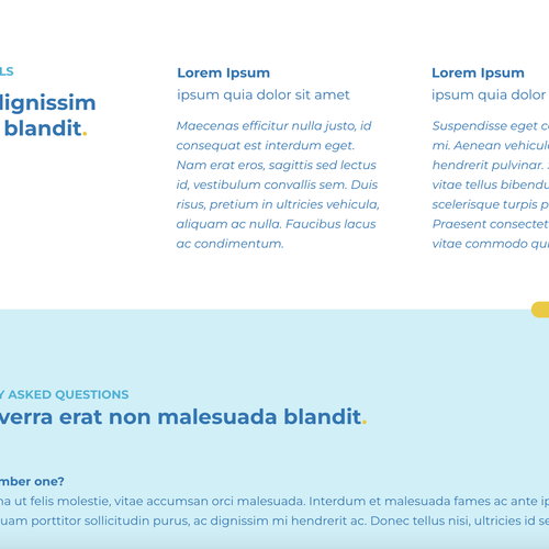
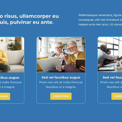
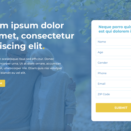
The colors on the site are blues and yellows. It's very modern and sleek looking site. I envisioned the logo to simply say Part C, possibly with the C to be inside of a pill, or incorporate some sort of pill or capsule in the design. I'm open to an actual logo, but felt for the company name and demographic having Part C with something healthcare related next to it or around it would make sense. I am looking for easy to read and modern, but again the target audience is 65 and up, so keep that in mind!
Archivos finales del concurso
1 x Logotipo
Archivos finales
Si usa tipos de letra que requieren licencia, confirme que el cliente esté de acuerdo con su uso. Por motivos de licencias, es mejor proporcionarle a su cliente información sobre cómo adquirir el tipo de letra en lugar de proporcionarle los propios archivos.
El texto en logotipos debe convertirse a letras sin relleno.
Obviously the copy write isn't in yet, but these are screenshots of the site.