Información necesaria
Nombre de la organización
NetWorth Realty
Industria
Bienes raíces e hipotecas
Descripción de la organización y el público al que apunta
A CRM, contract management, lead management, and central sales tool for our agents.
Detalles del contenido
Descripción
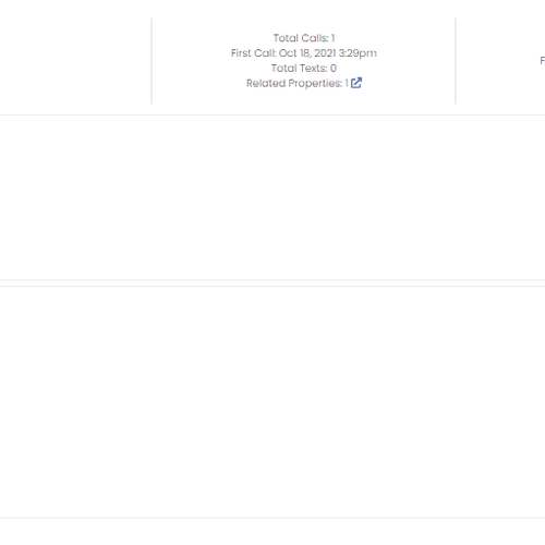
Over time, we have added sections to our contact's information card and it has become disorganized and difficult to navigate. We would like to fully revamp it to make it more intuitive for users and better organize the content and functionality. The contact card is the hub for communicating with our partners and easily viewing prior communication and activities. All of the information is currently on one long form but we are not tied to that; whatever UI is best for our users is what we want to go with. An example of our current form is attached - we need to include all of the components currently on the card.
UPDATE:
We like what we see so far! We would like to make the following clarifications:
1. Rather than leaving the fields open to edit at any time, we would like to "lock" them and include a button to specifically open the editable field. The hope is that it can streamline the main interface by not needing bulky field boxes and that our users won't inadvertently update information. Optimally we would have a modern, sleek, and clean "human-readable" view (unless the user is in edit mode).
2. It seems the best designs tabulated the information and we agree that is the way to go. Please take a look at the new attachment called Contact Card Sections where we break down the primary tabs as well as sub-categories that fall within them for clarity.
3. For the correspondence section, we have included some inspiration for a potential way to view the information rather than the typical table view. Correspondence can come in various forms (email, text, calls) and we will view the information chronologically as well as having the option to filter/view just specific types of information. It would be great to have this section updated to reflect that.
4. An important part of this project is ensuring that the sections with a lot of data like marketing and related properties are as clean and simplified as possible. If you feel any of the info or actions could be organized better or things added to make them more intuitive for the users, we are open to your design expertise!
Referencias
Otras notas
We have a good deal of flexibility in the design. This will need to fit into our existing program so we would prefer to stay along the same lines as our current color scheme as seen in the attachment (Primary blue #4c586f)
Imágenes de stock
El cliente permitió el uso de imágenes de stock en este concurso.
Las imágenes de stock son fotos con licencia y archivos vectoriales. Declare las imágenes de stock cuando presente sus diseños para que los clientes pueden pagar las licencias.
Archivos finales del concurso
1 x Diseño digital
Archivos finales
Si usa tipos de letra que requieren licencia, confirme que el cliente esté de acuerdo con su uso. Por motivos de licencias, es mejor proporcionarle a su cliente información sobre cómo adquirir el tipo de letra en lugar de proporcionarle los propios archivos.